Desk: Blogging app for Mac OS X
This is a review of Desk the blogging app for Mac OsX.
As usual, the best way to try out a blogging app is to use it write a blog post, so that’s what I’m doing here.
I just picked up Desk from the Mac App store for half off it’s regular price, so if you’re reading this now and it sounds appealing to you take a quick look to see if the sale is still on.
First impressions of this app are good – the interface is clean, letting you focus on your writing, but everything I’ve gone to look for has been pretty easy to find.
I started writing this post, then actually set up my blog connection and then added a title. I appreciate being able to do things out of order, so this is all positive so far.
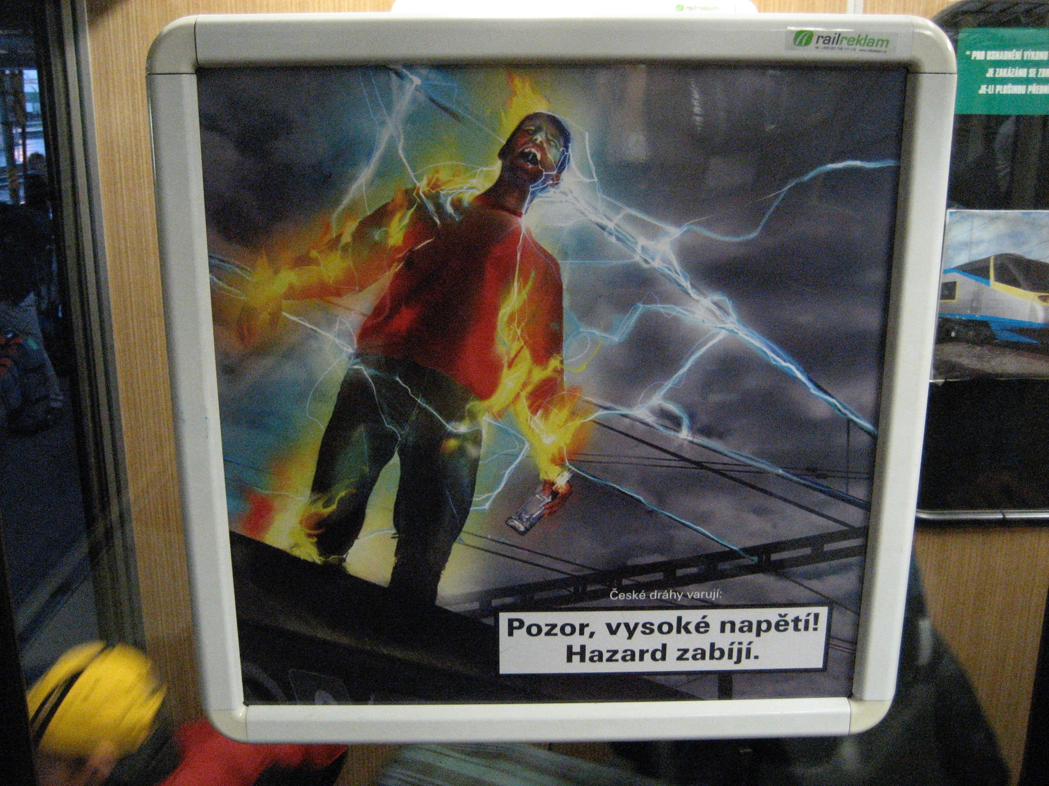
Next quick test, how does it handle images? Here’s a quick drag and drop of a creepy Czech safety sign:

Excellent, so far Desk is handling that very well. A super easy task to drag and drop from finder. Clicking on the image gives you scale handles and shows current pixel size in the corner.
Before purchasing this copy of Desk I looked over some reviews from the first version (I’m currently using version 1.1). The consensus for that first version was that it had potential, but it also had some rough edges. But the one very positive sign that I saw throughout these reviews was the developer responding. A developer that cares about their app and takes feedback into consideration as the revise should be the default, but it certainly isn’t. It’s a very positive sign to see this kind of interaction.
My blogging needs are not complicated, but I’d like to streamline the process for posting to wordpress and perhaps Desk will be the app that helps me do that, so far I’m very happy with it.
My next test is get this post tagged and published and take a quick look at the HTML code it’s generated to see how efficient it is there. I’ll wrap this post up after I’ve tried that.
Well there we are, all online and published! Looks like the code is clean so that’s good. There are just a couple of concerns raised in the process of publishing this article:
1. Visually Desk doesn’t seem to separate paragraphs. This means that for each paragraph above I entered two line breaks to make it look correct in the Desk visual editor but once published every paragraph had a huge space between it which I’ve gone in and manually removed in the wordpress editor.
2. The categories, tags and featured image settings don’t seem to be directly accessible from the main posting window. At first glance I’m not even sure how you’re supposed to get to them. I ended up stumbling upon them and they seemed to be under the blog settings. It seems like they should be easily accessible directly from the story editing window. It’s possible that they are, but I haven’t found them yet. Guess I should read the help file. 🙂
Despite those two issues everything else runs smooth. The line spacing in the visual editor seems like a major oversite, but I’m hopeful the developer will address that soon, or perhaps there’s a workaround I’m unaware of.
The real test will be to see if I continue to use Desk to create new posts on this site and get used to the work flow. So far I’m hopeful, it definately seems like it could be a more efficient way to work than the wordpress editor.

