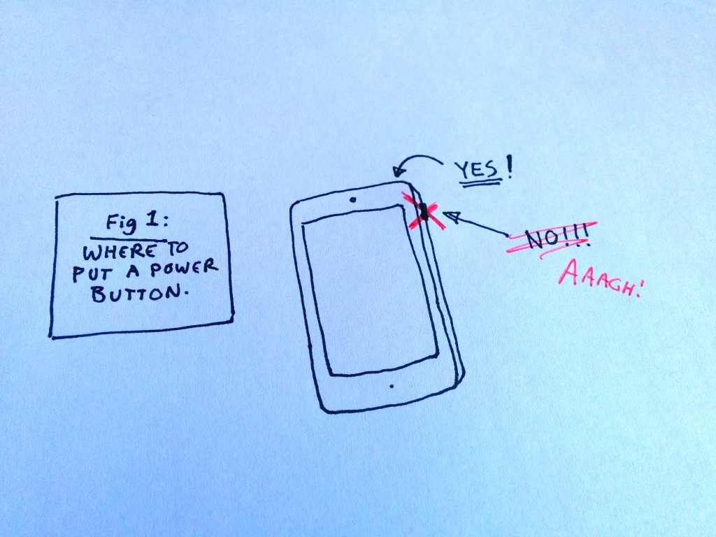
Please Apple, don’t copy the Android power button.
There’s a number of rumours out there now about what the iPhone 6 will look like and what kind of features it will include, but there’s one thats bothering me and I hope that it’s incorrect.
Based on a leaked case design, some people think that Apple is moving the power button from the top of the device to the right hand side. This would put it in the same place as any number of android devices.

Please keep the power button up top. thanks.
Why this would be preferable I have no idea, unless its an internal engineering limitation. When I moved from an iphone to a galaxy note the one thing that bothered me was the placement of the power button. when you hold the device in one hand and go to adjust the volume your thumb naturally rests on the power button. This is annoying. The fact that you can securely hold your iPhone and simply move a finger to the top of the device to use the power button is a far better approach.
Despite the fact that my current Nexus 5 is the likely the phone I’ve been happiest overall it still suffers from the power button location. At least there I’ve found an app that does away with the powerbutton all together – Gravity Screen just turns my phone on automatically when I pick it up and turns it off when i set it down or put it in my pocket.
The iPhone 6 might be a lot of great things. I might even be tempted to move back to iOS if I can get a larger screen, but I sure hope they don’t move the power button to the grip side of the device.
