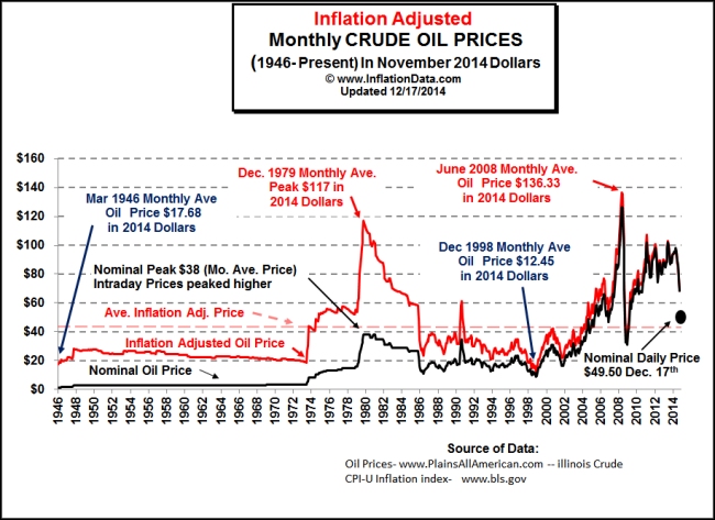
Ride this graph of crude oil prices as a roller coaster!
One of the great things about technology is the way that it lets us see things in new ways. Lenses let people build microscopes and telescopes so we could see things the naked eye couldn’t. That led to the exploration of the hidden world and opened up an huge amount of discovery and invention.
We’re not doing anything so noble here, we’re turning price charts into a roller coaster!
So that’s what this is.

If you take this inflation adjusted graph of crude oil prices from 1946 to the end of 2014 and smooth out the curves you get a track that can be used in a roller coaster simulation:
The inflation price date comes from inflationdata.com and the nice folks over at Oxen Media made this video for us.
Oil prices have edged back up in the last few days after a big drop. Based on the past it looks like we’re likely in for more ups and downs in the future.
You can find more of these economic roller coasters over at chartcoaster.com

